hiya... soo for part 6 I'm likeing the delicacy of the color as well as the lack of focus on the axis. It creates an even balance. But I do kind of loose the info in the middle/top left and bttm right because the opposite corners are so dominant in content and the shapes created by the color.
part 5, the color choice is unexpected but I enjoy it. If I knew Michael Gericke's work, I might assume that it was reflective of his style, which could be positive or negative. The overlapping is really succesful in transitioning from one group of info to the next. The way you treated the main block of information next to the grey logo creates a bit of tension, but because of the centrality of the text i think the focus is pulled more towards the text.
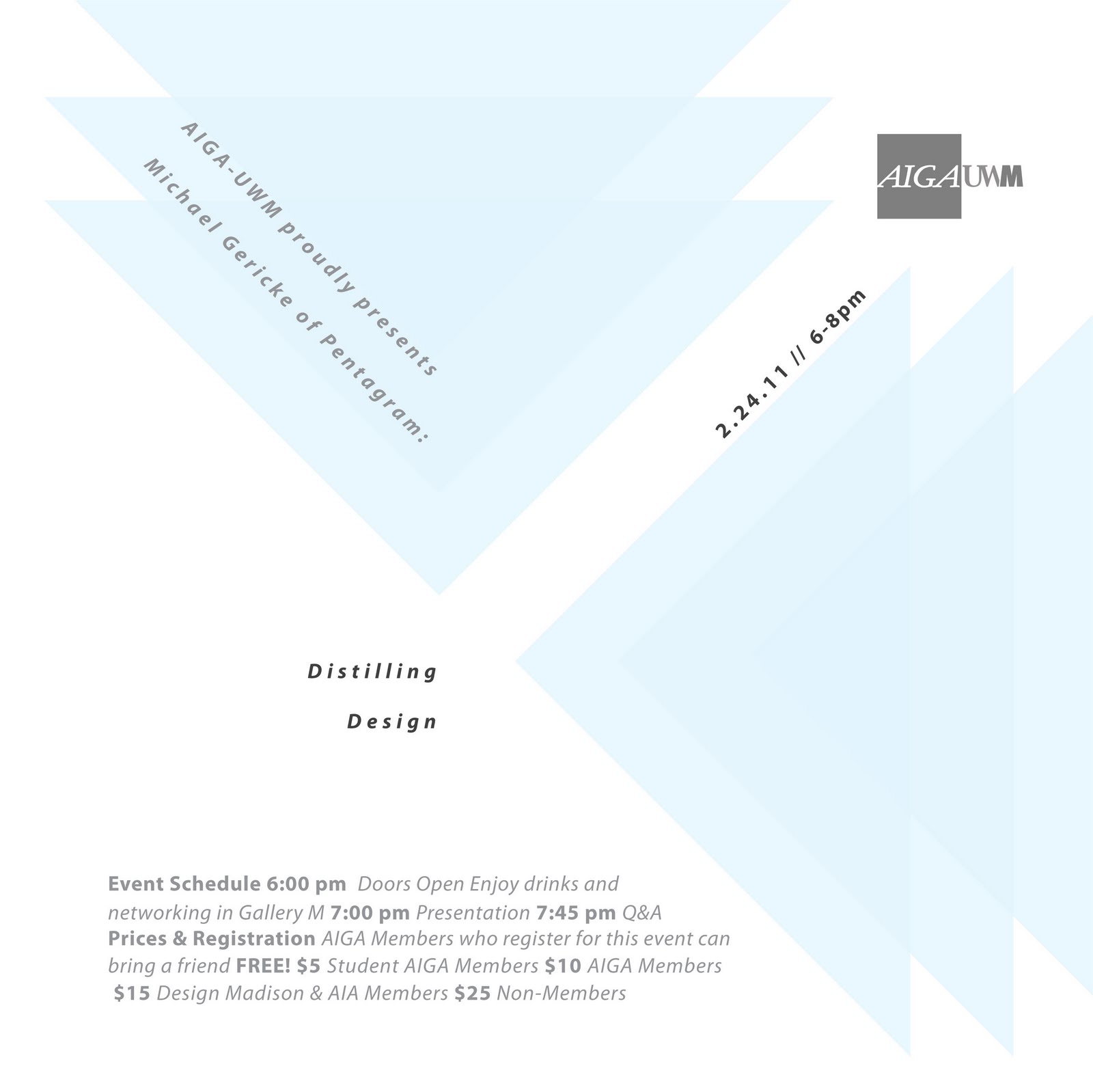
For part 4, what I think makes this successful is the proportions within the colored area versus the white (is looks about 3:1). It's simplistic but very readable and legible. The date and time become the last thing i look at, but I think thats just peachy because it's already touched on within the main text.


hiya...
ReplyDeletesoo for part 6 I'm likeing the delicacy of the color as well as the lack of focus on the axis. It creates an even balance. But I do kind of loose the info in the middle/top left and bttm right because the opposite corners are so dominant in content and the shapes created by the color.
part 5, the color choice is unexpected but I enjoy it. If I knew Michael Gericke's work, I might assume that it was reflective of his style, which could be positive or negative. The overlapping is really succesful in transitioning from one group of info to the next. The way you treated the main block of information next to the grey logo creates a bit of tension, but because of the centrality of the text i think the focus is pulled more towards the text.
For part 4, what I think makes this successful is the proportions within the colored area versus the white (is looks about 3:1). It's simplistic but very readable and legible. The date and time become the last thing i look at, but I think thats just peachy because it's already touched on within the main text.
woohoo!